


aboutME
I love anime and games so much, that i actually
spend more time creating than consuming,
i can not help myself but to have a sketchbook close to me when
watching or playing and to try representing what moved my hearth
just a moment before.
All of this done through DESIGN.
MY 2 MAIN GOALS WITH DESIGN ARE:
1. To impact, attract and to engage emotionally with
people utilizing your creations as the source,
making this happen through creative ways utilizing design as the main tool.
2. To keep up with a more demanding social media,
maximizing the amount of content per creation and solidify the
value of the effort you put into your work at the time that we try to
reach as much awareness as we can.
This series consists of creating designs respecting common structures. Using key words and an analysis of the character to portray them correctly. Achieve, beneath the original structure, an innovation in each of the designs.
- Ichigo's design is focused on a character presentation poster.
- Kenpachi in a drama or action movie poster with a darker and police style.
- Yorucihi's focused on a magazine cover.
Each design reflects characteristics or details of the character, the items used on it are carefully selected to reflect those.
GUIDELINES FROM THE SERIE:
During the first stage, I generated several sketches on paper, using keywords that represented the character and my perception of them. These keywords indicated the artistic direction of each project.
In each design, I had to respect a formula and a system to reach a constant level of quality. It also helped me to have references of all kinds and to make several stops during the process to correct and rethink.
All of this while respecting the serie guidelines, which the main ones where about: Typography, Color, Imagery
ABOUT RESEARCH AND STORYTELLING
As for the color palette, I used one main color in combination with black and white, which are typical of the Shinigami clothing used in the series. The main color was selected based on the character's details, powers or personality.
The main images used in each design are an appearance of the characters in the last arc of the series. By carefully selecting these images, I was able to highlight iconic moments of the characters and their importance in the final arc.
This series of designs is focused on a context where a new product (such as a series, video game or movie) is about to be launched and is a need to present all the characters participating in the product. A secondary version is also created to test the impact and effectiveness of the campaign in the classic A/B test.
GUIDELINES FROM THE SERIE:
The design was done with a playful typography approach and a lot of focus on colour, carefully working the tone and saturation for a very harmonious visual. The outside structure was inspired in cards, and as a whole, it was worked to direct the first eyes to the characters.
ABOUT RESEARCH AND STRUCTURE:
This was inspired by bus or metro posters, where normally you have huge visuals and a simple structure to focus on calling attention.
As it doesnt require that much representation, research or creative work, this project is more economic compared to previous one. The template structure facilitates multiple variations in little time.
All of this without losing the quality and impact.
The video version is an extention for the project, as the main reach mostly come from this format on social media. This also comes alongside my principle of taking the most out of every project to reach social media demand and maximize awareness by putting out more content in ways that can increase the impact on the viewer.
Video achieves this in a much better way than image by my own experience and analysis, being able to mix music, voice and animation.
This series consist on creating promotional content for the anime series. The guidelines were to utilize original source material, holding a typographic approach to keep a modern look.
GUIDELINES FROM THE SERIE:
I have managed to learn through working a lot on social media, that refering to the original source helps building the impact and connection of the work(As also anime excels in this, having a lot of emotional impact)
With this in mind, i paired the design work with the animation as a way to increase the effectiveness of the content promotion. The art used in the designs match perfectly with frames from the anime, which were used in the video version.
Lots of typography, a bit of line and a bit of texture are the basics across the designs, as part of holding a recognizable similar structure between the series.
The video version is an extention for the project, as the main reach mostly come from this format on social media. This also comes alongside my principle of taking the most out of every project to reach social media demand and maximize awareness by putting out more content in ways that can increase the impact on the viewer.
Video achieves this in a much better way than image by my own experience and analysis, being able to mix music, voice and animation.
Music is one of the most powerful parts of Anime, it can easily get someone to view it just by its music, it can also create a strong remembrance on it.
"So how can we promote the anime AND the ost?"
With this question, it was required an innovative way to present the music, as we needed to link both the anime and the Original Soundtrack.
While sketching the layout and idea for the design, i knew that i wanted to have a modern, magazine style visual for the presentation of the ost, as part of the innovation on how to present music.
As it was going to be animated, movable parts were had in mind while designing, such as the interface in the upper and lower part, which moves in the video version, and the representative items in both corners.
With all of this in mind, a structure was made, one that can be respected across the different designs but with enough personalization to represent the character on it.
You can see a close thing done by VizMedia on the promotion of "Bleach: Thousand Year Blood War" in here:
https://www.youtube.com/watch?v=ac1n2cyx-SY&ab_channel=vizmedia
I just came a little bit further in this project and have it animated.

A new representation of character showcase was in thought, one that follows a structure like the previous one but with a more "Modern" and Design approach rather than illustrative.
I have applied more typographic work, combined with intense use of textures and high color contrast. Each design incorporates elements and colors representative of each character, inspired by modern trends in typography and texture design (after an extensive research of some top notch designs)
*its a very design based design, we went for very clear and solid guidelines for this serie to represent the character and also that sustains the structure across all of the images done.
GUIDELINES FROM THE SERIE:
- Details about their constellations and titles.
- The character's name in transparent font, along with a detail about their name or position in white.
- A representative symbol of the character in the top left corner.
- The character's elemental icon.
- Colors related to the character's clothing and a noticeable use of Tone/Saturation to harmonize.
ABOUT RESEARCH AND STORYTELLING
In this section, I have delved into the story of each character, researching their position in the game world, constellations, names, and nicknames. Inspired by their element and appearance, I have carefully chosen colors that best represent them. Additionally, the background image used for each design symbolizes the character's origin in the world of Genshin Impact. Emphasizing the importance of research and careful selection of elements to faithfully represent the history and personality of each character.
Create a very recognizable pattern beneath the works, yet, represent character personality and/or background through style decitions on each design, as this is a serie to present multiple unique characters in a sustained basis.
In this series, i decided to go with typography, line and form playing for that unique representation of each character as the main source of expression. This way it holds the serie simple in terms of guidelines to assure that the visual style is going to be kept across all of the works, while also letting a lot of space for that previously mentioned expression.
Like, what i had manage to think by hearing a lot of smart people says xD:
"Creativity is being able to work with what you have, not with everything that exists"
This limitations live up to that.
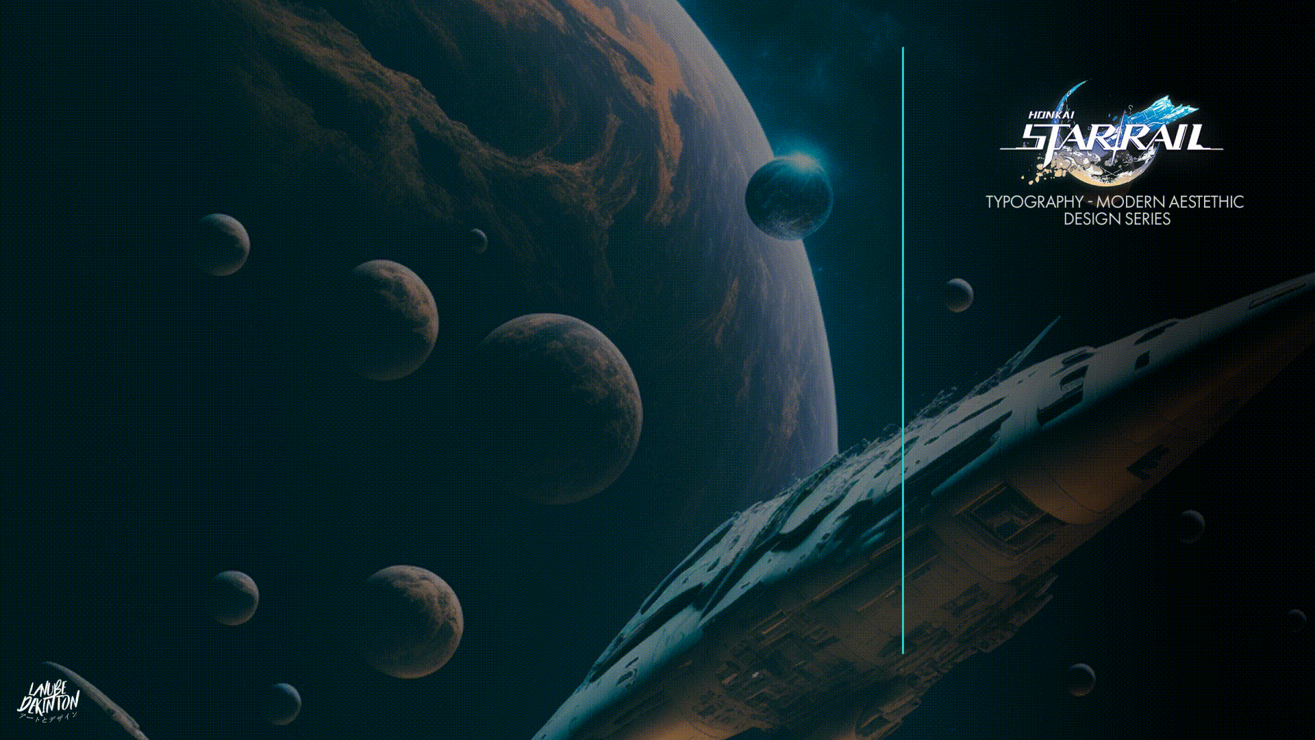
GUIDELINES FROM THE SERIE:
- Name Etiquette on the right, can variate form, font and weight.
- Showcase VIA on the left, doesnt hold major changes available. The font is preseted per via, the colour can change to match design harmony.
- Simple linear colour background with just one texture of shadow.
- Big bold handsome character in aproximately same position and size.
ABOUT EACH DESIGN DECITIONS:
- Dan heng has a cold and calm personality, representing that via an organized and clean layout. The background typography was positionated in a way that evokes movement.
- March 7th is a lively character, so we have a lot more of playfulness on its layout, a lot of movement and depth is represented with the line and typography work (as a bonus, upper part was inspired in a space warp). We also played with the representative two colours from her design.
- In Welt Yang, we went for something that explains his past a bit, the lower part represents his relation with a faction before the space warp from universe to universe, the middle main text intents to represent a train station, while the right side has a lot of text, that reminds its very talkative personality, just because of all the experience and knowledge he has.